


As promised L.K. Hunsaker, Author and Cover Artist has written today's post for us.
Thank you L.K., for the guest post and sharing your insights with us.

Books are indeed judged by their covers. Fair or not, it’s fact,whether we mean it as a metaphor for people or as actual books. You can’t get around this simple truth and no matter how often you scream that it’s unfair, it won’t change as long as we have eyes and unique personalities.
I’d like to thank Thomas for having me today to talk about cover design. A little about my background: I started my college career headed toward a commercial design major. It felt a little too stifling (no computers for it in those days – it was done by hand on paper sketching one symbol for a three hour class doing nothing but getting the lines exactly straight or exactly round), so I switched to an art major. Well and then I took a psychology class and fell in love, so I switched my major to psychology and my minor to art and English with plans to head into art therapy. So here I am: a novelist.
Funny things happen along life’s road. Still, I’ve loved art since I was a child and have continued with it, degree or no. I’ve done blog headers and signatures for other writers, graphics for friends and family just for fun, business cards with logo design for a big music industry name, and there are two CDs by a big name musician turned indie that I designed and did some interior writing for that ended up limited editions. I’ve also done cover designs.
I’ve done all of my own novel covers, both print version, including the full wraparound design, and ebook. I’ve also been commissioned for a couple of others and I’d love to show them off but I don’t believe they’re out yet. In my quest to create unique, standout, or simple but effective covers, there are a few rules I follow.
First, I never, never use clip art. Yes, it can be done well. But it can also be done by more than one author. There’s always the chance someone else will use the same photo. And often it’s not done well. Have you seen those covers that scream, “I cut out and pasted a few elements together to fit my story”? I’ve seen many. I have to say I’m pretty darn unlikely to buy a book that looks like the author stuck stuff together and called it a cover. It shows lack of quality, which is a shame because the actual book may be high quality. But, we do, indeed, judge a book by its cover. I might download one free. I won’t buy it. I was shocked to see one of the big six publishers putting out a title by a big author, last month I believe, that looked like clip art stuck on top of a photo. It’s horrendous. If I was that author, I’d be rather upset.
I use my own photos. With the quality of even inexpensive digital cameras, any author can take a nice scenic photo that will work as a background. Mixing elements from different photos can be tricky (so it won’t look like clip art), so I’m very careful with the way I combine them. There is artistic sense that goes into this part of it. If you have a chance to take a basic art and design class, you might consider doing so.

I also use my own artwork. Sometimes I start with photos of people in the correct poses and then turn them into art: computer drawn as with my first two Rehearsal books, sketched in conte crayon as with Finishing Touches, or done in watercolor as with Moondrops & Thistles.

Less is more. Don’t overcrowd your message. Sometimes something as symbolic as an ocean at sunset is enough to create the mood. (Please don’t use that heart drawn on the beach image that I’ve already seen on at least four book covers as well as on a plethora of websites. Careful not to overuse an image. Be aware of what’s out there already.) And be sure the mood created on the cover matches your story. Colors have meaning. Use them wisely. And use white space (white space doesn’t have to be white, it means empty space used as an artistic element).
Make sure your title font is easily legible. That doesn’t mean use only Arial. In fact, avoid the overdone Arial. Fancy fonts that match your story are nice if people can read them. They won’t try very hard. Unless you have a very strong simple cover that grabs them and a small title in contrast that leads them to NEED to know what the book is called. Careful with this, though. Most often, they won’t try that hard.
Other than that, be aware of your overall message. Is your book a hard-core thriller? Don’t make it look like a comic book or a poolside escape read. Be honest with your reader from the start, and that includes your cover art.

Take time to peruse covers of all genres, preferably in a bookstore but online will work. When one draws you in, study it to see why it did. If it makes you skim past, stop and go back and figure out why. For me, pastels, beautiful scenery, vacation vistas, water, and poetic art covers make me stop and look. While I may be halted by the photo of a bare-chested hunk, I won’t buy it, since it’s the story that matters to me, not the skin. Other readers won’t buy a book without that hunk. So know your intended audience and design to them.
Or find a designer who will do that for you. Local independent artists are a nice place to start and generally won’t charge a lot. If nothing else, ask your local high school art teacher for a recommendation.
Do be aware that if you contract an artist to do your cover design, unless the contract (or agreement) states otherwise, the amount you pay only covers the right to use it on your book, not on posters and T-shirts and bookmarks, and you can’t pull out an element of it to use on your book trailer without permission. Most hired artists want extra for that. Make sure your terms are clear.
Designing book covers is an art. Like any art, practice and study (or a well-chosen designer) will help make your book stand out on the storefront.
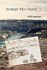
I’ve included a few of my own cover designs. Feel free to ask questions about them or about anything else I’ve mentioned here.
How to visit, see her book covers, and follow her blog.
Website: http://www.lkhunsaker.com/
Thank you again L.K., we wish you more success than you can imagine.
Indie Authors who need cover art help, here is a good place to start!! Posted in: Cover Art Designs Book Artists


13 comments:
Thomas, I'm glad to be here today and I'll gladly ask questions as well as I can!
Loraine, Your covers are so artistically done. They always catch my eye. It was interesting to learn the process behind image selection and fonts. Thanks for sharing your knowledge.
Maggie
Thank you, Maggie! Your two most recent covers are enviable, by the way. ;-)
I myself am afriad many times to approach an Editor or Artist about Pricing, because I feel I can't afford it. I know every work and job is different but could you give our readers an idea of what a cover might run? Do you offer Specials of any kind? I thought if authors could see that it is maybe more affordable than they imagined it might make them more comfortable in checking into Professional Cover Design.
Ah well a "professional" designer can charge from $300 to around $1000 which does tend to be out of reach for many indies. And that's nothing
against them. Most have spent a lot of money on schooling and on the programs they need to do the most up-to-date design work.
I have a very old design program and this is a sideline, not my main career. So no, I won't produce the covers you'll find from the Harper
Collins folks and such. My aim is to provide nice eye catching professional-look discounted-price designs, better than you'll get if you download one of the "free" cover templates from do-it-yourself companies that tons of people have already used, but inexpensive enough
to be manageable for most anyone.
Currently I have $9.95 designs featured. I plan to do some that involve original artwork that will be a bit more and try for a variety. I'm not
sure I'll offer less than that since it does involve time, plus hosting fees for the downloadable images, and the Paypal fee.
If you want something similar to what I have, or if you have an idea of what you want, I'm always willing to discuss it. If it's no more complicated than what I've posted, I'll do it at the same price. Time is a big factor. Original art takes a lot more time than photo manipulation, of course.
LK Said
Ah well a "professional" designer can charge from $300 to around $1000 which does tend to be out of reach for many indies. And that's nothing against them. Most have spent a lot of money on schooling and on the programs they need to do the most up-to-date design work.
I have a very old design program and this is a sideline, not my main career. So no, I won't produce the covers you'll find from the Harper Collins folks and such. My aim is to provide nice eye catching professional-look discounted-price designs, better than you'll get if you download one of the "free" cover templates from do-it-yourself companies that tons of people have already used, but inexpensive enough to be manageable for most anyone.
Currently I have $9.95 designs featured. I plan to do some that involve original artwork that will be a bit more and try for a variety. I'm not sure I'll offer less than that since it does involve time, plus hosting fees for the downloadable images, and the Paypal fee.
Thanks, Thomas. Not sure why Blogger kept deleting my comment!
TC, I'd say with non-fiction the title/subject matter is your biggest pull, but it should still look sharp and show what's inside. ;-)
Have you done much with Science Fiction Book Covers?
Not so far! I'm fairly realist-brained but if you tell me what you have in mind, I could give it a try.
I know what you mean about books with identical elements on them. It makes it look like it wasn't good enough for its own cover. I wish I could design at least a good, original banner but I'm afraid my talent is like zero. I thought about getting Photoshop but I haven't a clue how to use it. You know, all those bare abs covers just start to blur after a while. I love the covers you designed. How wonderful to have such talent.
Sarah, thank you!
Yes, it does look like the author couldn't be bothered to be original when she uses the same cover image as has been done, or when its obviously a template she stuck her own photo on and just changed the title and name. And if so, why would a reader believe the work itself is original or professional?
Those bare abs are really all the same, aren't they? They do tend to sell to a specific target, though.
Post a Comment